Logo is one of the most powerful and impactful marketing element a brand can have. Logos of various graphical elements have been used for centuries, ever since the ancient Pharaohs who gave their gods names and symbols to represent them.
In previous article, we talked about the color meanings and its psychological effect on audience’s psyche read more about it and what your logo color/s tells about your brand?
Logo designs have progressed and evolved with incorporating sophisticated typography and artistic shapes and color schemes. Logo is the visual representation of the brand that conveys the brand’s message and values. Composed of intertwined aspects that consists of color, typography, symbol and shape.
Surprising effects of logo’s color scheme swap
Each logo design has a significant importance to how people perceive the brand. Most importantly how recognizable and the psychological effect the logo have on people.
- Advertisement -
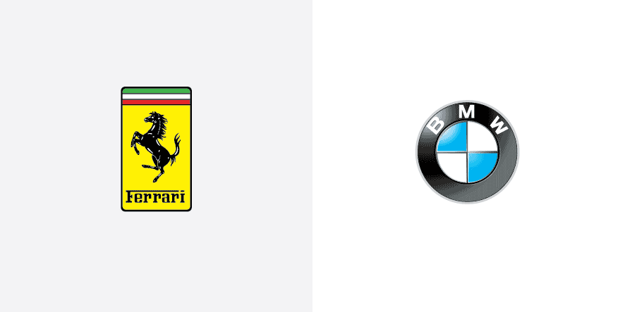
Many exercises have been conducted to test people’s reaction if popular brands’ logo have been color swapped with their competition.
We will dive ahead in this interesting adventure of the psychological effect when a brand change its logo design or packaging as part of a campaign, and not re-branding because that is a whole different thing.
This experiment was conducted by the Brazilian graphic designer Paula Rúpolo caused lots of confusion and made lots of viewers uncomfortable and unconsciously feeling awkward.
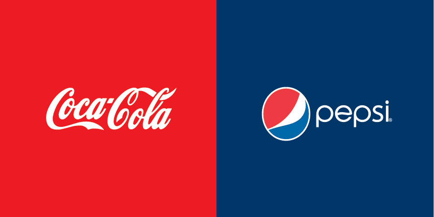
This strong reaction from people was due to the swap of only the most recognized color schemes, however what will happen when they change the typography? Or both? Can you imagine McDonald’s iconic yellow M with a a red typography of Burger king’s logo? Strangely weird and doesn’t seem right, huh?
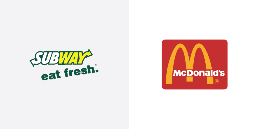
It differs in each country however, Here is the list of the most recognized logos worldwide; Coca Cola, Apple, McDonald’s, Nike and Google.


What will last, your logo’s color scheme or customer’s loyalty?
The question now, if a brand changed their logo’s color scheme will the confusion change customer’s purchasing habits? Will brand’s loyalty surpass such awkwardness?
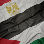
Recommended Read ➤Pepsi Turn Red To Support The Egyptian National Team
The reason behind brand’s changing color scheme is a strong indicator to the purchasing habits and if they will be affected or not, for example; Pepsi “The official sponsor of the Egyptian Football team” changed their cans packaging to the Egyptian National Football Team jersey to support the national team in the 2017 African Cup of Nations. Ironically, the national team’s jersey is “red”. Is it an unnecessary risk? Or is a strategic tactic at play here?
On another occasion when brand changed their logo color scheme is the German airway enterprise, Lufthansa when they changed their logo to grey on social media after plane crash, read more about Lufthansa’s more and how it influenced more brands to join in their #indeepsorrow.
Also Read ➤ Lufthansa Change Logo Colors on Social Media After Plane Crash
Brands go to great length before creating their logos, doing competitors analysis, studying the market, their targeted audience and most importantly what their brand stand for, what is its core values and allocating the right color scheme that helps in conveying the message. The ultimate goal for brands is to create a simple recognizable logo.