The implications of color’s effect on people’s emotions are far reaching, and understanding your customers’ connections to certain colors could increase the effectiveness of your company’s branding methods. Almost 85% of consumers cite color as the primary reason they buy a particular product, and 80% of people believe color increases brand recognition. Have you ever considered the importance of color in branding?
Coke is red. UPS is brown. IBM is blue. These corporations understand the proper use of color is vital to creating a positive image among consumers. Furthermore, color plays a huge role in memory recall. It stimulates all the senses, instantly conveying a message like no other communication method. Here’s a quick break-down:
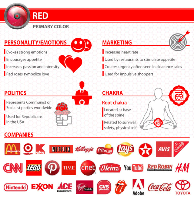
Red: energetic, sexy, bold
Red: Red activates your pituitary gland, increasing your heart rate and causing you to breathe more rapidly. This visceral response makes red aggressive, energetic, provocative and attention-grabbing. Count on red to evoke a passionate response, albeit not always a favorable one. For example, red can represent danger or indebtedness.
- Advertisement -
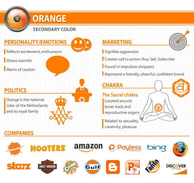
Orange: creative, friendly, youthful
Orange: Cheerful orange evokes exuberance, fun and vitality. With the drama of red plus the cheer of yellow, orange is viewed as gregarious and often childlike. Research indicates its lighter shades appeal to an upscale market. Peach tones work well with health care, restaurants and beauty salons.
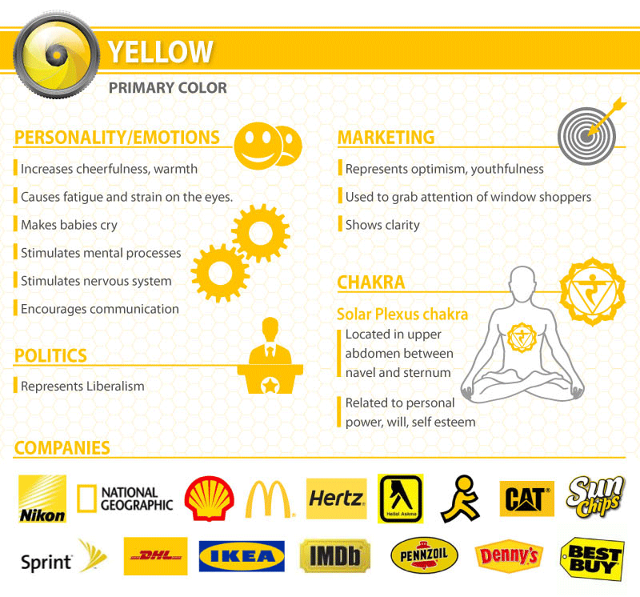
Yellow: sunny, inventive, optimism
Yellow: In every society, yellow is associated with the sun. Thus, it communicates optimism, positivism, light and warmth. Certain shades seem to motivate and stimulate creative thought and energy. The eye sees bright yellows before any other color, making them great for point-of-purchase displays.
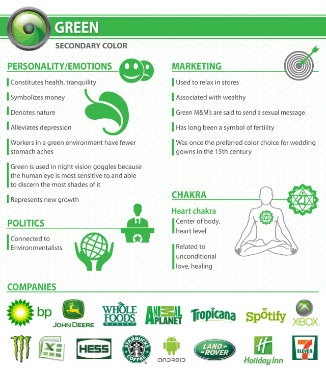
Green: growth, organic, instructional
Green: In general, green connotes health, freshness and serenity. However, green’s meaning varies with its many shades. Deeper greens are associated with wealth or prestige, while light greens are calming.
Blue: professional, medical, tranquil, trustworthy
Blue: Cool blue is perceived as trustworthy, dependable, fiscally responsible and secure. Strongly associated with the sky and sea, blue is serene and universally well-liked. Blue is an especially popular color with financial institutions, as its message of stability inspires trust.
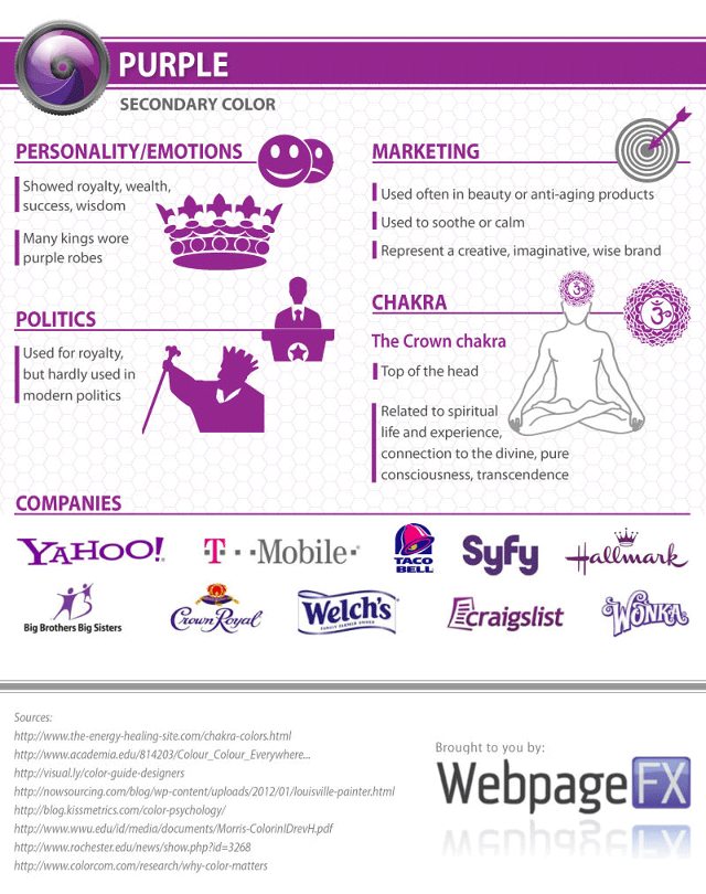
Purple: spiritual, wise, evocative
Purple: Purple is a color favored by creative types. With its blend of passionate red and tranquil blue, it evokes mystery, sophistication, spirituality and royalty. Lavender evokes nostalgia and sentimentality.
Black: credible and powerful
Black: Black is serious, bold, powerful and classic. It creates drama and connotes sophistication. Black works well for expensive products, but can also make a product look heavy.
White: simple, clean, pure
White: White connotes simplicity, cleanliness and purity. The human eye views white as a brilliant color, so it immediately catches the eye in signage. White is often used with infant and health-related products.
Pink: fun and flirty
Pink: Pink’s message varies by intensity. Hot pinks convey energy, youthfulness, fun and excitement and are recommended for less expensive or trendy products for women or girls. Dusty pinks appear sentimental. Lighter pinks are more romantic.
Brown: rural, historical, steady
Brown: This earthy color conveys simplicity, durability and stability. It can also elicit a negative response from consumers who relate to it as dirty. Certain shades of brown, like terracotta, can convey an upscale look. From a functional perspective, brown tends to hide dirt, making it a logical choice for some trucking and industrial companies.
Source: research complied by web design and marketing company WebPageFX