[dropcap style=”2″ color=”#f50a0a” text=”D”]esigner Mackey Saturday explains : Instagram has a new logo, and it’s lovely. In particular, the “I” at the beginning looks more like an “I,” but the company kept a script-style font (a nod to the brand’s love of all things nostalgic) and generally cleaned it up a bit. Here’s the previous look, followed by the new design. Yes it is a subtle change, and no the icon doesn’t appear to have been touched.
[blockquote style=”quote” align=”” author=” Mackey Saturday “]I had the opportunity to work with the fantastic team at Instagram to create their new logo.[/blockquote]
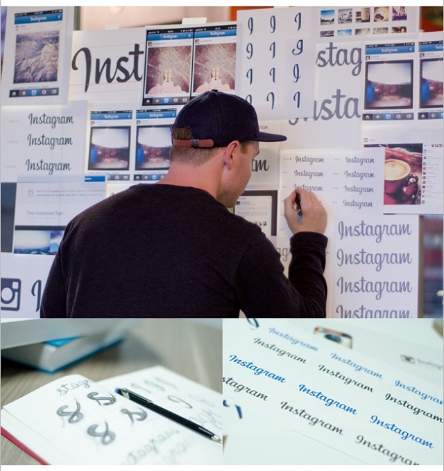
New Logo Explained //
I had the opportunity to work with the fantastic team at Instagram to create their new logo. It has been a long time coming, and I’m honored to share the result with you. It was always essential that the design maintained everything that we’ve all grown to know and love about Instagram while creating a logotype that was more refined, durable, and that positioned the brand for expansion. Looking to the past to inspire the future, the script connects with the nostalgia that Instagram was built from, maintains the important character of the original typeface, and places the brand in a unique and prominent position both in the current and future landscape.
- Advertisement -
[Also Read: Instagram Camera By 2014 ]
The new design feels smoother and more fluid, and has a bit less personality, giving off a slightly professional feel.