Adidas Logo represents elegance, durability and without doubt represents a mark of the leading sports gear in the world.
Originally crafted by creative director Peter Moore in 1990, the performance logo was initially used on the company’s Equipment range of sporting goods. The three stripes come directly from those seen on early Adidas sports shoes, but also form the shape of a mountain, which represents the challenges athletes face.
How did apple get its logo? adidas – the story of a logo
The 3-Stripes mark is without doubt the quintessential adidas symbol. It was created by the adidas company founder, Adi Dassler, and first used on footwear in 1949. Dassler created a symbol that could be immediately recognized when his footwear was used in athletic competition and associated with adidas. He emphasized the association with the slogan “The Brand with the 3 Stripes”. The 3-Stripes were first used on apparel in 1967. The 3-Stripes now enjoy worldwide recognition as an adidas symbol.

1967 – Adi Dassler used the 3 striped Adidas logo on Adidas sports shoes.
- Advertisement -
1971 – This year marked the birth of Adidas Trefoil Logo. The Trefoil Adidas logo showed the diversity in Adidas brand. It was first used in 1972, and later became a corporate symbol.
1997 – The three striped Adidas Logo was re-introduced after being reengineered by Peter Moore, who was the creative director of Adidas at that time.
1998 – Adidas merged with Salomon and introduced a new corporate logo that represented brand values of both the groups. It maintained the blue color of Adidas and inherited Red color from Salomon. The logo incorporated 3 shapes to look like a diamond. The two arcs that extended upwards represented the arms of the winner, raised after victory.
2005 – The new Adidas “Word Mark” logo has been introduced. The new Logo is clear, simple, and confident and shows leadership.

In the late 60s adidas expanded into the leisure and apparel sector, and this prompted Käthe and Adi Dassler to seek a new, additional identification mark for the adidas brand. In August 1971, the Trefoil was born, out of more than 100 ideas. Inspired by the 3-Stripes, it is a geometric execution with a triple intersection, symbolizing the diversity of the adidas brand.
This symbol was first used on adidas products in 1972, and later became the company’s corporate symbol. Today it plays the important role of representing the adidas Originals collection.

In 1997, adidas decided to introduce an integrated corporate design, choosing as the core element a new and yet familiar logo: the 3 bars. It was designed in 1990 by the then Creative Director Peter Moore, and initially used on the Equipment range of performance products. It is inspired by the 3-Stripes as they appear on footwear. The shape formed by the bars also represents a mountain, indicating the challenge to be faced and the goals to be achieved.
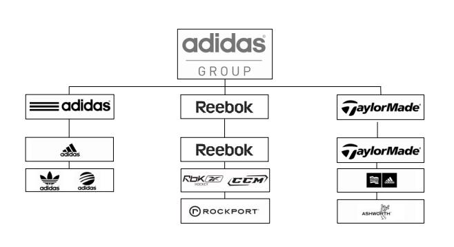
The corporate logo changed after the divestiture of Salomon in October 2005. The new logo of the adidas Group was launched in April 2006. The adidas Group logo is the umbrella under which all Group-owned brands stand. It brings adidas back to its roots by using the familiar adidas wordmark as a visual identity to the business community, strengthening image and impression.
From a design perspective, the new logo is simple, clear, and confident and shows leadership. It will support future business growth and is flexible enough to anticipate any unforeseen changes.

Source : www.adidas-group.com


