Established in 1991, Vodafone is one of the world’s largest telecommunications companies, with 523.5 million mobile customers and 18.5 million fixed broadband customers across Asia, Africa, Europe, and Oceania.
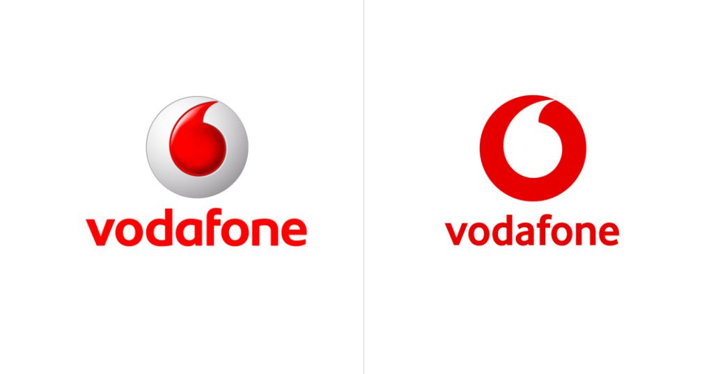
Last week, Vodafone introduced a new logo designed by Brand Union as part of a global brand re-positioning. Staying in place will be the Vodafone ‘speech mark’ logo that was created in 1998.
As part of a major global rebranding and brand re-positioning, Vodafone Group has launched a new campaign called “Hello” which forms part of the brand’s biggest advertising campaign in its 33-year history.
https://youtu.be/1TqaxX5K8yg
- Advertisement -
“The story of hello” video focuses on the constancy of human interaction even while technologies evolve over time.
The new brand positioning strategy and related advertising campaigns were developed after extensive research and concept testing by Kantar which included qualitative and quantitative responses from 30,000 people in 17 countries.
To help position the campaign further, Vodafone commissioned an opinion study with YouGov to determine how people felt about the future.
The study surveyed 13,000 people across 14 countries and found that, overall, people are more positive about the future. Nearly half, 48%, think that today’s children will have a better life, but nearly a third, 32%, think it’ll be worse.
The future is exciting. Ready?
Changing the ‘Power to You’ tagline the company has used in all of its advertising and marketing campaigns since 2009, and in comes a new slogan: ‘The future is exciting. Ready?’

Nearly 30,000 people in 17 countries had input into the new branding through market research. The language used in the brand tagline will vary from country to country so, for example, in Italy, it will be “il futuro e straordinario. Ready?”, and in Spain “El future es apasionate. Ready?” while in Egypt will be “اللي جاي أقوى. جاهز؟”.
The new identity will be used at all brand touch points, from advertising platforms to Vodafone retail stores and packaging. Vodafone currently has equity interests in 30 countries across five continents and around 50 partner networks worldwide.

Vodafone logo evolution
Vodafone redesigned its logo completely in 1997. All the older elements of the logo except the color have been removed. The red color in the Vodafone logo represents talking, sound and passion.
This logo was shaped as a SIM card. The “apostrophe” icon later becoming the Vodafone signature has been used for the first time. To incorporate the new logo to its brand identity, the word “Vodafone” also took its place in the logo. The space between two “o” letters has been designed to place the “apostrophe”.
The new visual identity will place much greater emphasis on Vodafone’s iconic ‘speech mark’ in the biggest change to one of the most recognisable symbols of Vodafone since the ‘speech mark’ logo was created in 1998.
The ‘speech mark’ will now appear as the central graphical focus overlaid on all marketing and marketing communications activity. The logo will also appear in a new 2D design in place of a skeuomorphic 3D approach.