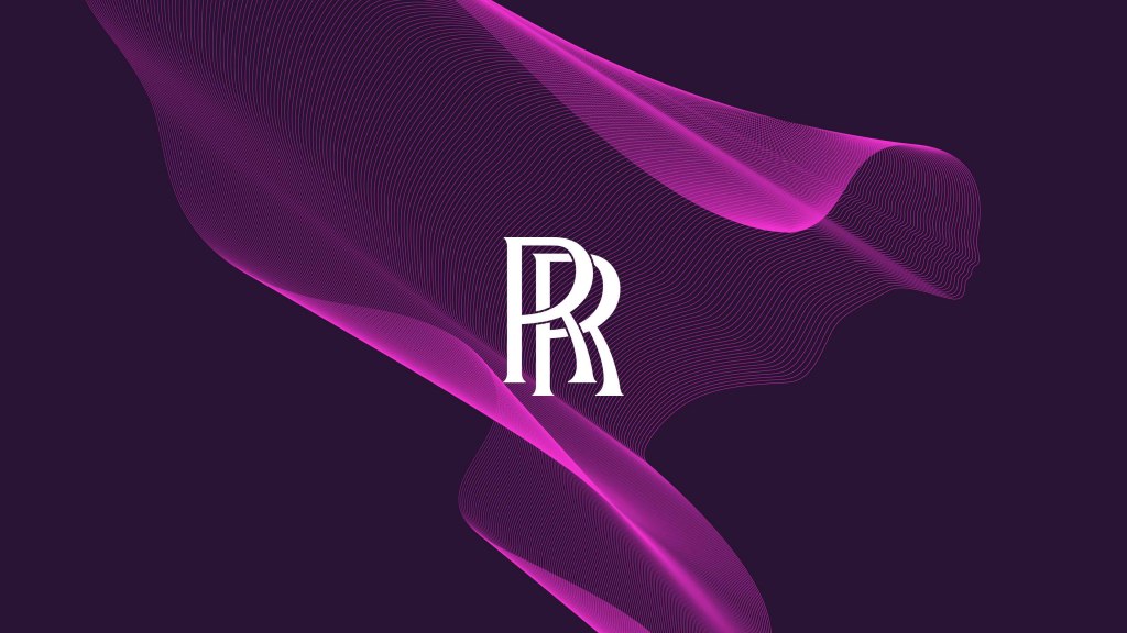
A very famous and luxurious brand joins the rebranding world and gets a new identity. The British multinational Motor cars and engineering company Rolls Royce has rebranded its logo and changed its identity to fit the current modern days.
The brand is known for its heritage and history and for how elegant it is, its name is always related to luxury and class; the brand always seemed to relate to an older audience but it was time to change this idea.
What Changed?
Rolls Royce collaborated with the designing company Pentagram to create a new identity for the brand that is still luxurious in a modern way, which we have to say, Pentagram succeeded in creating it. A few hours earlier, the new identity and logo for Rolls Royce were released.
- Advertisement -

Modernizing Rolls Royce Logo and Brand Spirit
Rolls Royce was known to attract an audience whose age varies between the 50s, but in recent researches, they found that the average age of their clients is around 43, which mean that the brand doesn’t only attract old people but the majority of its audience is in their young age. This is one of the reasons why the company decided to rebrand its identity to modernize it.
An Abstract Version of The Spirit of Ecstasy
The symbol was also transformed into an illustration that the studio stated that it resembles a silk fabric.
The original statue of the Spirit of Ecstasy figurine was designed by sculptor Charles Robinson Sykes in 1911. Over the past years, the figurine had had 11 main iterations but this time Pentagram has made some changes. The studio made it simpler since it looked too complicated and since the idea is to modernize, they made it feel like it was moving forward.
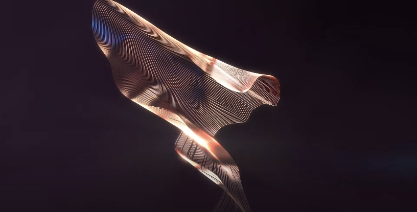
Also, the symbol will be used as the main logo for the brand.
The Company’s Wordmark
Rolls Royce’s wordmark was also edited to fit the rebranding and the new identity. Since the rebranding is based on moving forward and modernizing, Pentagram decided to make some adjustments in the wordmark.
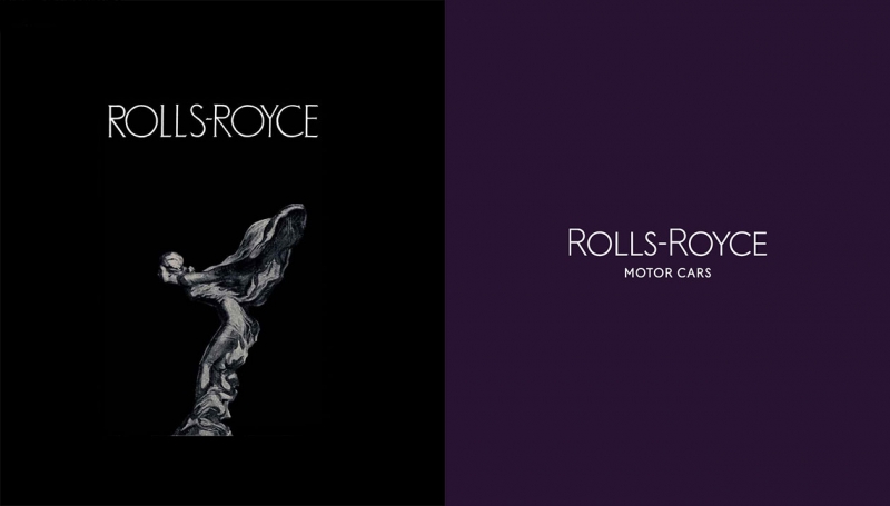
They changed the typeface from Gill Sans Alt to a similar font, called Riviera Nights that has a little bit of beveled edge in the letters L and E to give a sense of moving.
All of the letters are capitalized and the letter R is enlarged to have a connection with the monogram.
The Double R Monogram Is Edits Free
Pentagram studio decided to leave the double R monogram as it is because of its huge history and heritage.
Marina Willer, Pentagram partner stated the following: “We didn’t feel it was appropriate to change it, We did experiment with it a bit, but felt it would always look like we were trying to produce some kind of fake version of it because it is so valued and recognizable.”
https://www.youtube.com/watch?v=bBtjCvrFpIg
The New Identity’s Background Color
The designing studio went for the color purple that is complemented by a metallic rose gold to give the feeling of luxury, wealth, and power.
The official release of the new identity by Rolls Royce will be on the first of September.
Tell us your opinion of the brand new identity for Rolls Royce and did it modernize the brand?