Competition for a place in a shopper’s cart grows fiercer and harder year by year, and with so many new products or brands making its way to the marketplace, differentiating your brand and products from others through visual recognition is becoming more vital.
For some brands, they see it as the optimal time for an update.
This year alone, we witnessed 2 major FMCG Egyptian brands Juhayna and Domty release brand-new looks, packaging and logos. Domty released their brand-new juice product look earlier in the year, while Juhayna has just debuted their new updated aesthetic and logo last weekend.
- Advertisement -
Juhayna’s New Look and Feel
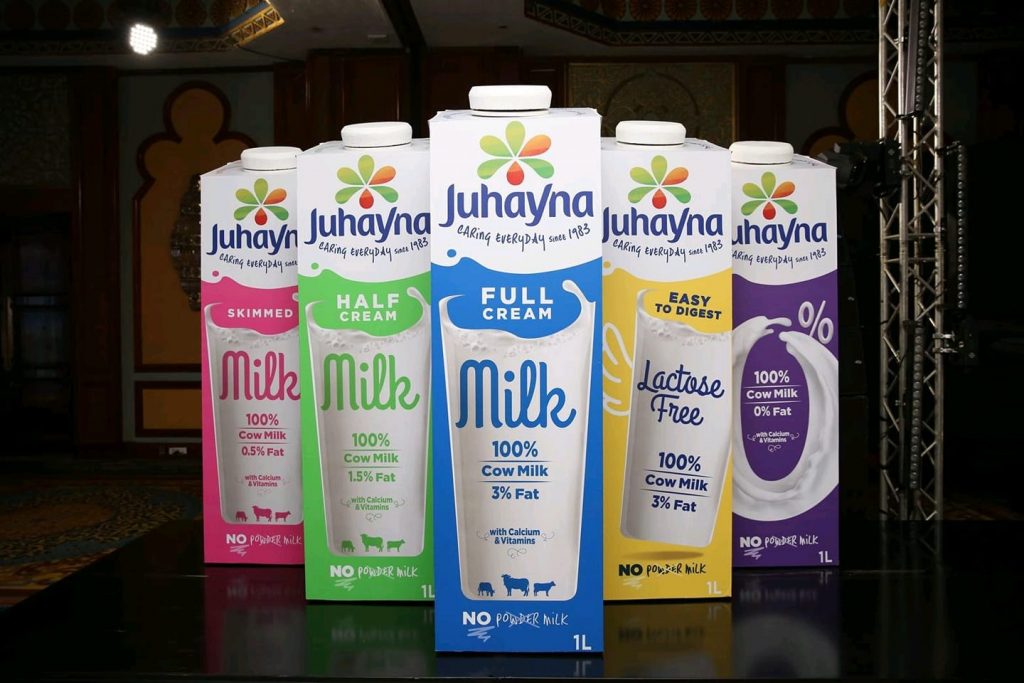
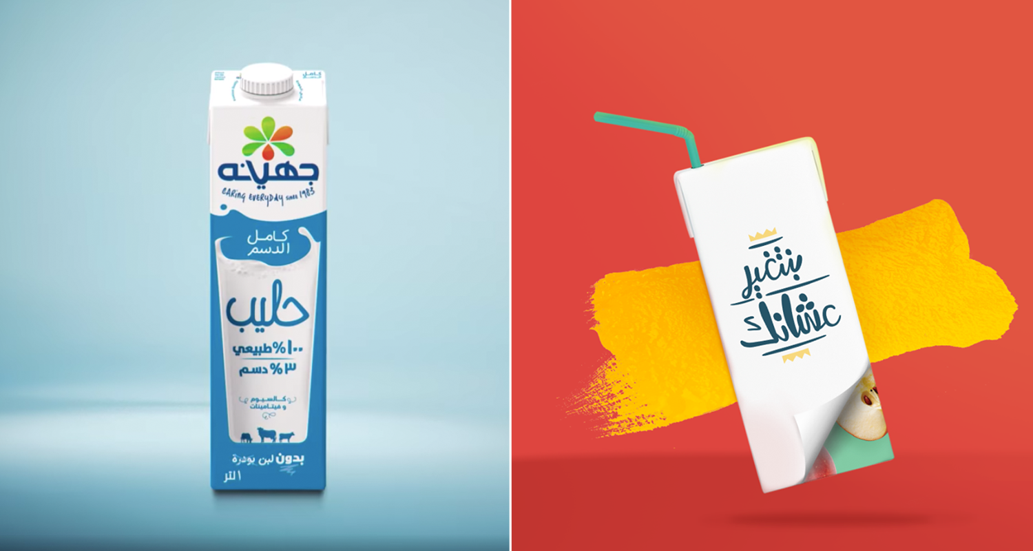
Juhayna launched their brand-new corporate logo as well as brand-new dairy product designs last weekend. The brand asked their social media fans for their opinion after posting the new product designs, however many fans were more focused on their updated logo.
Juhayna’s New Logo Creating Buzz on Social Media:
Other than consumers and fans, many graphic designers and marketers have discussed the brand’s choice in new logo. Some have questioned the choice of the need to change the logo, some voiced opinions on adding the slogan as a main part of the logo, and graphic designers were particularly disheartened by font choice and technical typographic issues on both English and Arabic versions.
When it comes to the new logo, the uploaded logo to Facebook may be a little low res (the icon’s gradient is grainy with harsh transitions) which may be fixed when printing on packaging, nevertheless the update isn’t much of an upgrade but isn’t that much of a downgrade either; The logo lands a little flat rather than encouraging a boost in morale from fans.
However, the newly launched packaging for their dairy products are much more promising.

Modern, young and captivating, the new packaging will help the brand catch the attention of the growing younger market. However, minor details such as the word “Milk” not being aligned specifically in the middle of the glass/design, the loss of the “Premium Quality” stamp by Juhayna on the front of the product and the fact that the full aesthetic has changed (logo and overall look) may lead to confusion, loss of brand recognition, and likability.
We know from the Tropicana mishap of 2009 that although a majority of consumers are not very loyal to packaging designs, enough changes and tweaks can lead to a major issue.
In the case of Tropicana, whose redesign at the time included a full overhaul of packaging design, logo design and even changed the main tagline of “Pure Premium” to “100% Orange,” the company lost over 20% of sales in 2 months as well as had to return to the previous design due.
The New York Times even covered the issue, stating that the decision to return to the previous design came “after consumers complained about the makeover in letters, e-mail messages and telephone calls and clamored for a return of the original look.”
Since then, many marketers have spoken about an important tactic when deciding to revamp product designs; don’t change everything.
With the new logo and new aesthetic direction with their dairy products, we hope that Juhayna keeps a sharp eye on sales figures and consumer recognition for the next few months for any similarities to Tropicana’s issue.
Domty’s Revival
Domty also released a brand-new product identity for their range of juice drinks earlier this year through a competition in May.
The decision is similar to Juhayna’s move, introducing a bright, modern and young look to their products. An important note is that Domty decided to keep their logo as it was, and will be keeping it in the center of the product to help consumers recognize the brand even with its drastic aesthetic change.
Domty’s decision to choose a new product look through a competition is a refreshing change, but was also such a change that many consumers actually did not believe that Domty chose an actual competition entry until the designer defended himself in the comments.
Prior to the competition’s launch, Domty went to the streets to interview several people on their thoughts on how the brand could improve their marketing, packaging and even new flavors.
Domty’s tactics were well-thought out when it comes to their new packaging; by engaging the actual market of juice drinkers, particularly the growing young market of buyers, the brand was able to position itself as more of a “juice of the people.”
While the competition could have been more high profile through ads and maybe even billboards, especially once a winner was chosen, Domty’s small competition will engage and build stronger consumer loyalty (for those that know about it at least) in the long run.
Updating Product Packaging: Dos and Don’ts
Overall, both product redesigns stand out on market shelves by being bold, playful, and more youthful to captivate the growing power of younger buyers, and may produce higher brand recall over time.
However, we have to remember that when a brand changes the look of a package drastically, there will always be a dip in brand recognition and sales which should be expected. In the case of Tropicana, due to so many major changes to its iconic and memorable aesthetic and even logo, competitors took advantage of the “Tropicana crisis” and gained the sales lost by the fruit juice brand.
While Domty opted to chose a new design that still included its main stay, their logo, Juhayna’s sweeping changes may cause some issue down the line. We’re hoping that Juhayna’s team has prepared for the possibility and have events, captivating supermarket product placement and brand recognition strategies to ensure people will quickly understand that this is the same premium “No Powder” milk product that many love.
For brands out there looking to update their product packaging, here are some quick Dos and Don’ts.
Dos
When doing a complete change of packaging design, ensure to keep at least 1 or 2 major memorable/iconic design elements or taglines from your previous popular design to ensure quick brand recognition early on
Colors, patterns and textures play an important role in your consumer’s decision making. Choose your colors wisely, and if your product range is mainly differentiated by color, keeping the colors to the corresponding product may help consumers adjust faster
Keep an eye out for shelf impact; a new look may look great on paper and as a single product in front of you, but may seem lost or indistinguishable on the shelf. Test it against competitors or similar products that your new package may be placed with to ensure its impact and distinctive factor.
Be bold and playful. Today’s market loves rebellious colors, designs and packaging, but remember that simple still beats complicated designs.
Don’ts
Don’t create designs that are overly-specific. Your brand may increase its product portfolio later on, so new packaging designs should not be restrictive for future adjustments.
Don’t forget what your product is; blind focus groups will help you ensure that your design still embodies and represents what the product is and its function
Don’t forget to stay up-to-date with packaging trends and technologies that may give your brand an edge on the shelf


