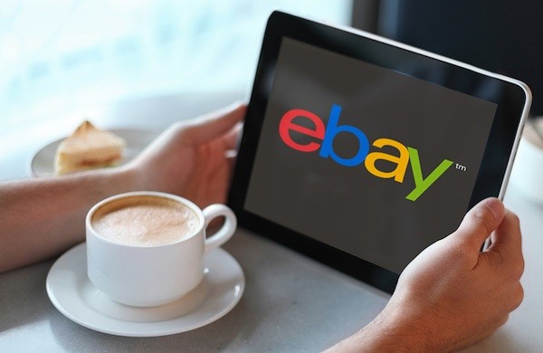
eBay president Devin Wenig says the new logo is part of its effort to reinvent the 17-year-old brand and create a new eBay. Wenig says the site today offers a “cleaner” and “more consistent” experience than before and that the crisp letters in the logo reflect that. Retaining the color palette was important, however, since they represent eBay’s “connected and diverse” community of buyers and sellers, he wrote.

eBay chose the font Univers Extended for the logo, says Dianna McDougall, a New York-based designer. Although the font is relatively open, the letters are squeezed tightly together. The choice of a simple font is reminiscent of Microsoft’s new logo, which the company revealed in August.
The new logo will officially roll out in October (the site’s front page still displays the old logo). Visitors to the site should expect to see it then, and eBay says it will be launching an advertising and marketing campaign at the same time.


