Qatar won the the right to host the 2022 World Cup in a 2010 vote. The tournament will start on 21 November, with the final on 18 December – the national day of Qatar.
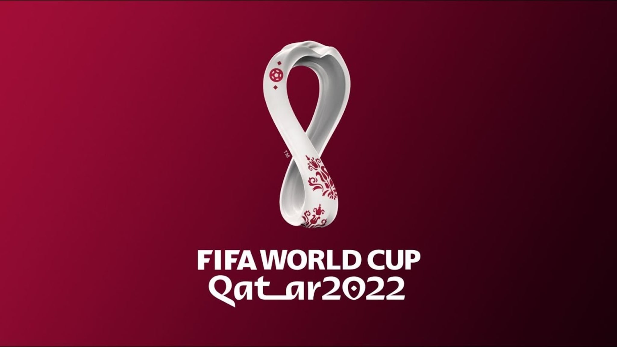
The shawl has landed! Or at least that is what the people behind the brand-new Qatar 2022 World Cup logo is aiming for, according to a lengthy and very detailed announcement as they released the logo for the first time on Tuesday.
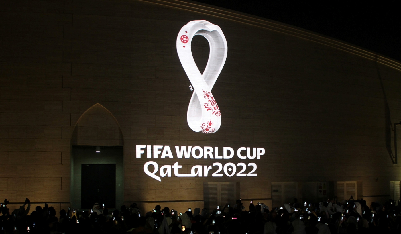
In the last 24+ hours, from creatives to everyday football lovers, almost everyone has been talking about the release. The logo was projected onto a number of historical/important buildings in Qatar, as well as many other countries, at exactly 20:22 Qatar time to signify the championship’s date.
A symbolic move for the country, whose choice to release it also links back to the country’s independence from Britain on September the 3rd 1971. Qatar will also be the first Middle Eastern country to hold the cup.
- Advertisement -
However, as much as we’d like to simply get excited over the fact that the FIFA World Cup is coming back once more and so close, there has been quite a lot of attention on the logo, and I love a good new logo.
So, Here We Go!
The logo is gorgeous!
Got your attention? Good.
I’m not going to say it’s super ugly, because it is beautifully crafted, culturally relevant, well-rendered and well-thought-out. To a point.
The decision to make it a 3D object that is flexible, which is shown in one of the announcement videos below, gives it a wide range of applications and options for content, and we should always appreciate when type or anything is edited slightly to be more inclusive of different cultures and backgrounds.
The amount of thought and focus on cultural relevancy behind the logo should be applauded, as this is a very special moment for the country. Yet, we all know how overthinking can pull down a project, which is seemingly what has happened with the logo.
Most people agree with when you have to explain a joke, or the logo in this case, you’ve pretty much failed on your delivery.
Admittedly, explaining the thinking process behind new logos and branding is standard for most companies now which is why Qatar’s 2022 Logo explanation post doesn’t seem far-fetched but it is the need for an extensive explanation that needs to be looked at.
How is behind the Qatar 2022 logo?
According to FIFA, the emblem was a joint project between in-house designers and Portuguese design studio Unlock, who referenced everything from desert dunes and traditional clothing to the curves of the FIFA World Cup Trophy.
It’s the first FIFA World Cup emblem to go fully 3D, and also a marked departure from the incarnations of previous years, which have focused more on the shape of the trophy.
FIFA also points out how the “swooping curves” of the new logo represent the movements of desert sand dunes found throughout the country.
Floral details on the design echo the embroidery found on shawls typically worn in the Arab and Gulf region.
The Over-Analyzation of The Qatar 2022 Logo
With so many points being explained in one image, it’s hard to know where to start.
We could start with the observations that many have already had. Some have said its coloring and shape led them to believe it was a new Cancer Ribbon or a piece of decorative China.

We could discuss the fact that someone or multiple people decided to overcomplicate a major logo; the logo features several cultural references, 2 FIFA World Cup references, and decorative elements.
Together, they make a compelling argument on whether the logo is effective in its job to be a symbol of the new World Cup.
In many ways, it does. It symbolizes many of the hosting country’s cultural cores such as the shawl or scarf, how it alludes to Arabic Calligraphy and historical geometric patterns with the football, as well as the shape is derived from the shape of the trophy (however this is not clear until you put it beside the last 2 WC logos (Russia and Brazil).
![]()
In other ways, it fails to do so.
It looks too similar to the famous and multi-purpose cancer ribbons, its floral patterns look very generic or closer to European style Damask patterns, has no clear connection to football or the championship (when not explained) and consists of too many different nods and references that are not prominent enough to be grasped at first or even second glance.
Many of the cultural references will also be lost on those not familiar with Gulf culture; although this is a great way to introduce people to them, the logo doesn’t fully emphasize or embrace these references enough to really teach foreigners about the customs and traditions of the country.
This defeats the purpose of a logo; something used to differentiate from competitors or other logos, to tell a short story at a glance, or something completely memorable and unique for easy brand or product recall.
The logo is beautiful, it was created to emphasize the country’s historical and cultural elements while bringing in an innovative touch with its 3D option, but at the end of the day, would it do its job as an effective tool in marketing the 2022 World Cup without a massive ad push to improve logo recollection?
Tell us your thoughts in the comments.