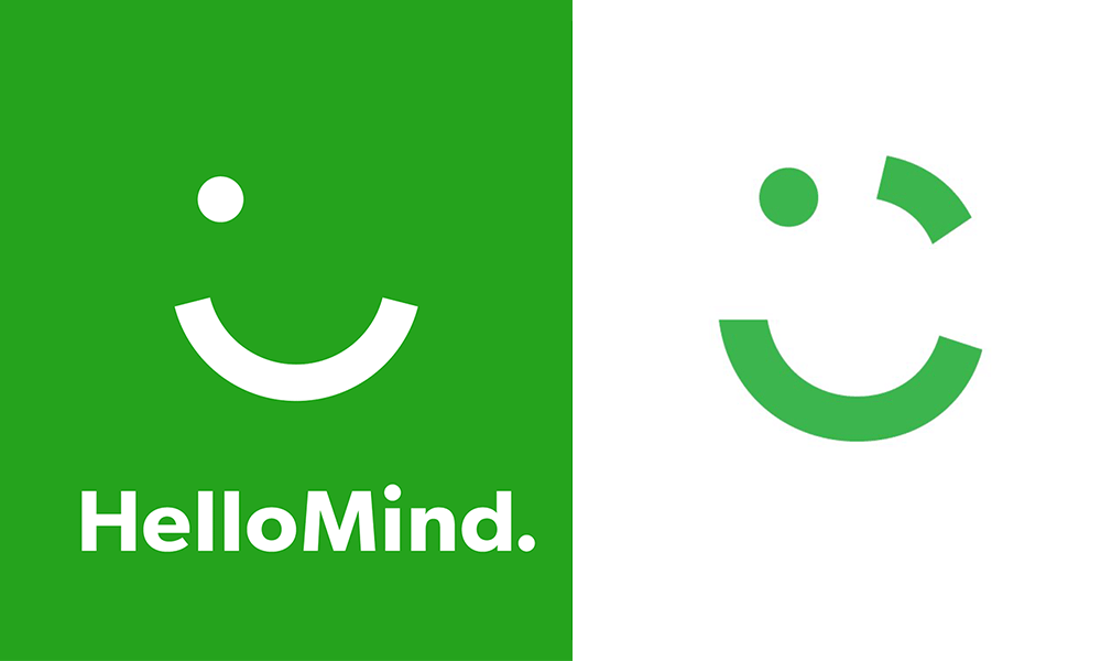
Brand‘s logo is one of the most important aspect of your organization’s identity, it should align with your company’s philosophy. Reflecting its core values as it is the graphic representation of your brand.
Something of that importance should be designed with the utmost care, authenticity and precision as the whole purpose and goal of creating a logo is building brand recognition, instantaneous recall of the brand.
Design Originality is the Key:
The last thing any brand wants is a logo that lacks authenticity, resulting in getting the brand mixed up with another or causing confusion.
Creating a recognizable, original logo is achieved when you build the logo around your brand’s core values and not solely on inspiration.
The difference between logo imitation and authenticity is the essence of the logo. The number of logos created are countless, so how to stand out? Well, it is a challenge however, when you chose the right color -preferably warm colors to be easy on the eye- that reflect your brand’s mission, it resonate with your audience more, as well as, the design should suit your brand, it is good to renovate and go beyond the obvious, however the logo should make sense, and relate to your organization’s service or product. Along with, distinctive typography.
Careem Logo: Imitation or Innocent Mishap?
The region’s leading car booking app, Careem, has unveiled its new brand identity on September 19th to mark the company’s four-year anniversary.
Aimed at building on the company’s remarkable growth in the last four years, the rebranding initiative was revealed to support Careem brand complete makeover, with a new company symbol featuring a green wink and the implementation of a revamped strategy across all verticals.
Related Topic ➤ Careem re-brands and reveals a new logo
The goal of the rebranding effort is to give Careem an offline presence as effective as its online presence and the story of the new logo was inspired from the community and company culture!
The surfacing of HelloMind logo and its uncanny resemblance to Careem, the multinational chauffeur driven car booking app.
HelloMind is a Danish company based in Copenhagen, Denmark that developed a mobile application with easy access. HelloMind mobile app designed to provide an effective hypnosis sessions to users to break negative thought patterns and improve their quality of life.
HelloMind app is developed to help you change or eliminate low self-esteem, stress, fear, bad sleep and unhealthy habits. HelloMind can be used by anyone who is open and willing to make a positive change in life.
HelloMind’s logo is created by Stupid Studio the Danish design agency, the application of the design which fits the brand’s voice and suits the organization’s mission, translates the message quite efficiently.
With all the hype over the rebranding of careem, with a smart marketing strategy, we are quite disappointed about the logo now under this new light!
The Internet Never Forget about Copycats:
When organizations neglect one or more of the above mentioned pillars when creating their logo, it is easy to unconsciously -or even consciously- copy another brand’s logo, even with minimal changes, your audience will get confused or they will lose their trust in your brand’s authenticity.
So it pays off when you spend the time and resources in creating your logo and even more when you are re-branding.
Because by now you already know that the internet never forgets, combination of searches and the original logo will surface and your brand will be in a very uncomfortable position.

Leave a Reply Cancel reply
You must be logged in to post a comment.