


2017 was a crazy year for design, and an exciting year for social media designers all over the world.
With every year comes new challenges, and it rings true especially for those in the content industry. One of those is the content design community, which have to keep up with the newest design trends each year.
Well this year, it isn’t just designers that should keep an eye out, but as people get more influenced by social media every year, marketers have to start keeping an eye out as well for the year’s top trends.
Here are our predictions for 2018’s social media design trends.
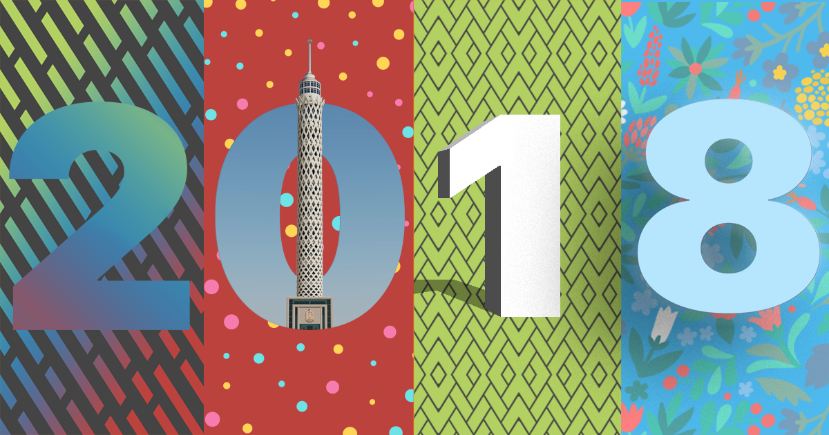
Different and bright color schemes
Usually, we know the unwritten rule of working with a brand and social media design.
Stick to the brand or logo’s colors.
Well, 2018 is the year to go wild because brands are escaping this rule and running wild and free!
Companies are now looking for new ways to stand out in the social media landscape, especially one as saturated as ours. Certain companies are rebranding specifically for this purpose, and they’re rebranding with the rainbow.
Look at Dropbox, whose 2017 decision to throw away their 2-solid color scheme has seen much success, and their new catalog of bright and various colors.


This new change enabled Dropbox to widen their creativity for their customer’s online experience and for their social platforms, without changing their extremely well-known logo.
The new brand colors show Dropbox’s growth and maturity, going from a simple online storage website to a place for creatives to share work.
Now, Dropbox is a colorful and extremely visible presence on the internet, with a wide range of fun and eccentric social media designs.
The international online auction house and seller, eBay also moved on to brighter colors, creating a more exciting social media and website.

For social media, an abundant set of bright solid colors can help separate you from competitors, as well as keep customers interested in following your page, maybe even favorite it.
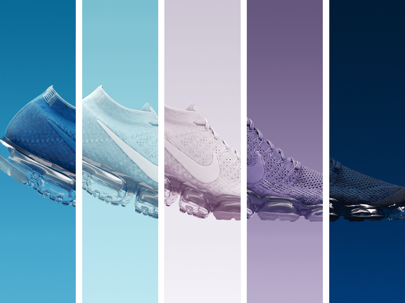
Mesmerizing Gradients
Gradients may have been around for a while, all the way back to our elementary days when giving your essay titles a rainbow gradient made you feel super important and professional, but it’s continuing to brighten up boring backgrounds with a vengeance.
Already making a popular comeback in 2017, this trend seems to be building even more momentum, and may well be a main design trend of 2018.

Designers are going to have fun playing around with different color combinations, and customers are going to love it, from the simple 2-colored to gradient meshes with over 5.
For social media, this trend is another fun and exciting change for many companies, with the same benefits as bright solid backgrounds.

Last year, Instagram’s decision to go gradient was mocked by many, especially with their new logo.
But, now the popularity of Instagram has made it clear, gradients are a great way to reach out to younger generations.
Double Exposures
This was such a big trend in 2017, from the beginner designer to high-end pros, websites and portfolios were filled with them.
This simple to do, at time, design technique has captivated audiences all of last year, and the trend will only continue to grow.

Although not feasible to maintain as the sole design style for your social media page, unless you only post occasionally, it is a great way to keep your audience coming back for more.
A great double exposure can also prompt many to share a beautiful image.
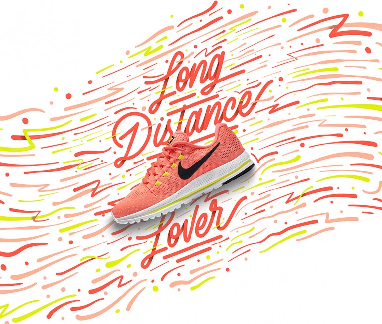
Typography Exposure
Here is a tricky design technique, tricky because its name is hard to figure out, that can elevate any social media page, especially service providers such as travel agencies, with a few clicks of a button.
Typography exposures have been around for a long time now, but has only been popular in certain industries.
This year, however, the style is coming out of its bubble and may make itself a strong social media constant.


The style is both simple and chaotic, but overall lends a clean and modern look to many designs. It is also a look that can be created for a daily content schedule.
The style can be found under other names as well, such as Typography with real life elements and negative space typography.
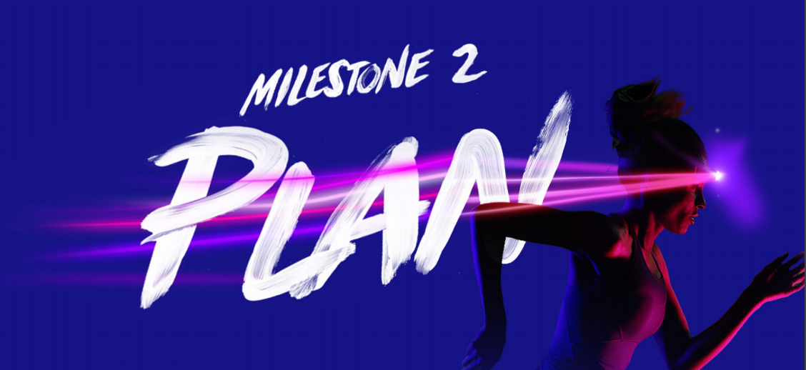
Bold Fonts
This is a trend that separates itself from others, by being headstrong and intrusive with a hint of in-your-face.
Designs using these big bold fonts are in-your-face, jumping out of the mundane timelines and dragging your eyes to them.
This trend is simple to add, and yet also simple enough to capture attention without being too crowded.
Another trend within this trend, trendception, is the usage of bold handwritten styles of fonts. These capture the eye even more than the usual bold font, as something new and fresh to let our eyes feast on.
Adidas does a great job of this, using beautiful handwritten fonts, in bold, to send out a powerful message.

Adobe also does an amazing job of mixing the two styles in their 2017 Digital Marketing study. Honestly, Adobe, being the world’s top creative everything, is using a bunch of last year and this year’s trends.
They are definitely winning the design race.

Creative Background Patterns
2018 is the year of the background, and here comes another trend that is going to sweep the world.
Creative backgrounds, with illustrations or simple geometric shapes, are having an amazing time on social. They’re clear, make images more catchy and dominant, and add a fun mix to any posting schedule.

*Maan Ali/inspirationde.com
Styles can range from product icons, geometric shapes such as circles, dashes, to personalized illustrations or icons to make you or your brand feel more authentic or closer to your audience.
Cinemographs and Better GIFs
Cinemographs made its way into our hearts, and social, only recently but is continuously growing in popularity.
This trend lends a classy touch to any still photo. Simple movements or happenings within the cinemograph can seem graceful, fluid, and elegant, unlike its cousin the GIF which is usually fun and colorful.
It may seem daunting to work on cinemographs, and may take time, but perfecting this design/GIF trend could land your brand a lot of love.

Branded GIFs had a strong presence last year, even after a small Facebook issue at the end of the year, and will continue to build its strong presence.
Simple, straight to the point GIFs have a big chance of dominating social in 2018. Try using some of the other trends in parallel to maximize its strength.
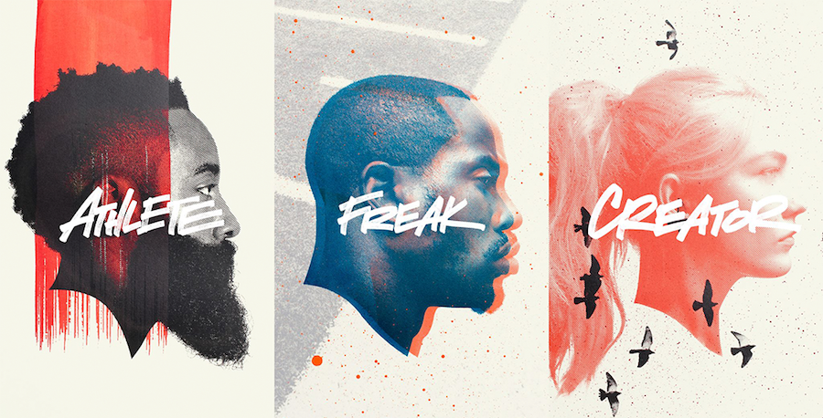
Split Page Design
A simple yet captivating evolution of the classic “hero” image for products.
This design trend simply switches the hero image to add more elements to the table, contrasting images and items to further catch the eyes of those scrolling through their timelines.

*ManvsMachine
This is a great trend for product pages, adding an entertaining yet simple touch to product posts, as well as images.