


For over 235 years, sparkling beverage brand Schweppes has made everyday life a little bit bubblier with its signature bubbles.
Internationally, Coca Cola owned brand Schweppes has been getting quite the rebrand as efforts to ensure the brand becomes “future proof” continues. The global rebranding campaign aims to strengthen the brand’s “quality” image with a new look and packaging.
The sparkling soda drink’s Egyptian branch is no different, but of course, they’ve put their own touch on the rebranding.
Did you know that Schweppes’s founder Jacob Schweppe was the inventor of the manufacturing process of bottled carbonated mineral water, which would later be used to create sodas?
Experienced, Elegant and Suave
Schweppes jumped into the local scene in the late 1970s, rising up in the early 1980s with what would become iconic ads with famed actor Hassan Abdeen.

The brand has built up years of experience and nostalgic influence with both older and younger generations. The brand’s longevity and heritage are main influences for the new rebranding efforts and ad campaign.
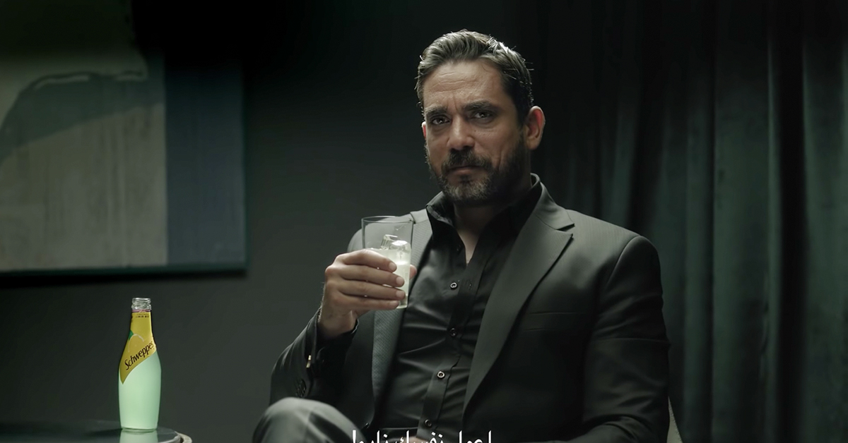
Schweppes’s new campaign leans heavily on the brand’s 235 years of experience. A series of ads have already dropped for the rebranding starring Shereen Reda and action star Amir Karara.
The setting is very similar to another iconic campaign, “the world’s most interesting man,” and is extremely refreshing of the brand to add a female voice and situations.


The campaign positions the brand as the high-class drink for everyday situations. The moody lighting, short and to the point narration, and smooth jazz music all push towards a new level of self-esteem and sophistication for the brand.
Rebranding
Schweppes rebrands with a new logo.
A contemporary move from a serif font logo and classic swish shape to a more crisp and modern sans serif font logo and straight strip of its recognizable golden sheen texture.
https://gph.is/2l3Jct5
This move helps the brand step closer to the modern world, as well as provides better legibility on digital platforms and various mobile devices.
It also gives it a more elegantly simple look that goes with its new suave aesthetic the brand seems to be aiming for.
Read more on how fonts affect your brand > How to bring new life to your brand by changing font’s typeface
The rebranding comes with a new bottle shape as well.
The new bottle’s shape is built smoother with a rounder bottom, which display a similarity to other famous sparkling liquids such as champagne, thus making it grasp the same elegant and luxurious feel.
The wrap around cover, now not covering the entire bottle, allows the bottle to show off more of its famous bubbling liquid.
It is a more sophisticated and graceful bottle, helping in the new push to position the brand as a high-class drink for everyday experiences.
What do you think of the new branding? Good enough to future proof it for generations to come? Let us know in the comments, and give us your take on how it could have been better.