


Since its inception in 1948 with the opening of its first restaurant in Zurich, the Mövenpick brand has expanded to encompass fine foods and a hotel business which has blossomed to become the largest member of the Mövenpick family. With the Mövenpick Hotels & Resorts portfolio flourishing, the time was right to refresh the brand identity in order to reflect the quality, relaxed confidence and amiable efficiency of today’s Mövenpick.
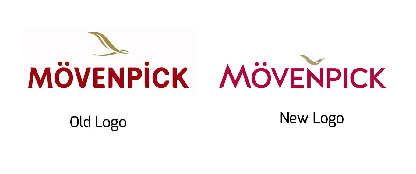
London’s strategic brand design agency Bulletproof was briefed to create the new visual identity, and went back to Mövenpick’s roots for inspiration. Legend has it that the founder, Ueli Prager, named his company after the simple, elegant yet efficient movements of a seagull – or “Möwe” in German, and a bird form has been a constant in the brand’s logo ever since. Bulletproof reimagined this element, imbuing it with “new depth and movement to let it soar over a cleaner, more modern word marque within a contemporary suite of Mövenpick corporate colours.”
Bulletproof notes that “The power of the bird icon continues through to the wider brand world, with the graceful lines of the bird’s wingspan creating the architecture for the visual identity as brand marque holders and windows into the Mövenpick world. Bold secondary colours offset the new Mövenpick corporate red, bringing life to the brand and adding vibrancy and variety to hotel brochures and communications.”
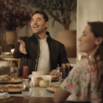
A new service philosophy, We Make Moments, will also come increasingly to the fore, bringing together the brand vision, values and core behaviours to create memorable moments for guests. These moments might be in the form of recognizable Mövenpick brand signatures like Chocolate Hour – interactive pop-ups offering a quintessentially Swiss chocolate experience, whether in hotel lobbies each day or even ‘on the road’ at industry events! Equally, they might be ad hoc, intuitive individual gestures that elevate apparently effortless ‘ordinary’ efficiency with an extraordinary, human touch of personal detail. Reflecting this philosophy, Mövenpick will adopt a new photographic approach focused on capturing candid, natural moments of wonder that hotel teams create for guests.
- Advertisement -
Nick Bosworth, VP brand and marketing, Mövenpick Hotels & Resorts said: “Mövenpick Hotels & Resorts is deeply proud of its Swiss heritage. But in a world that’s becoming ever more global – and with our own international footprint of hotels growing each year – we needed a corporate identity that would connect at a deeper level with consumers in every market. Bulletproof understood our global challenge implicitly, creating a corporate identity that makes the brand relevant to the modern, global consumer while staying true to our Swiss soul, and flooding our communications with the life and vibrant colour that only global travel can bring.”