Since its inception back in 1997, Hassan Allam Properties (HAP) has carved an enviable positioning of an exclusive boutique developer whose name is synonymous with credibility, trustworthiness and commitment. HAP values family tremendously and creates hand-picked selective communities where homogenous friends and neighbors become the chosen family. With its nationwide portfolio of projects in the city and by the sea, HAP has become an influential leading mover in the local property scene, making some wonder why it hasn’t had its own true spotlight?
Well, HAP has recently stolen the limelight, with its brand-new rebranding and awareness campaign. The campaign is finally letting HAP shine on its own, with a brand-new logo and signature line, and we’re giving you the breakdown.
New Key Messages and Slogan
Starting with, what seems to be, their signature line, “From our family to yours.”
- Advertisement -
Looking deeply into the words, it would easily seem that the brand is aiming for a tighter focus on community, heritage and family-orientated themes. Their new social media posts are currently emphasizing the themes as well.
With the word “family” comes the connotations, or secondary feelings/meanings, of family-orientated, trustful, looking both to past and future generations, devotion, a caring nature, and legacies.
And as we can see from their current posts, they are definitely aiming for it.
The word “our” in “from our family” could also be used as a link to the company’s mother brand, Hassam Allam Group, as well as a close bond to their employees, family-orientated values and customers. Family-orientated values are also subtly used through all three texts used in their new ads.
New Brand Visuals
Starting last week, the new visuals have been released both online and on out-of-home advertisements.
The greyscale photos are immersion breaking, as not many brands are bold enough to attempt greyscale when most are looking for more vivid and bright ads. This helps the photos stand out among the sea of brightly colored real estate billboards.
The rebrand also comes with a new logo for HAP, a gold paper/sheet textured Monogram. At first glance, you can see Hassan Allam’s initials on the logo, but a small design trick reveals a final letter, P for Properties.
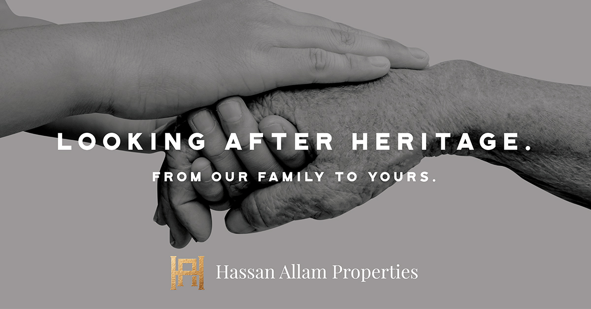
![]()
The greyscale images show three different stages of life; youth, adulthood and marriage, and the elder stages.
They are depicted holding hands, displaying affection and familiar relationships, which symbolize care, love, trust, unity, heritage, and legacies.
These three stages, and images, may represent HAP’s influence on families and their connection to each other. This can be easily concluded with the company’s line of family-orientated housing communities such as their Swan Lake , Park View, Little Venice and Seasons properties.
Their first image, “For Generations to Come,” illustrates the relationship between the old and newer generations. Continuing with their new signature line, “From our family to yours,” the image then reflects the passing down of experience and the careful planning to ensure their future.
It also exhibits a timeless physical and emotional connection, a lasting partnership that will continue through generations, such as HAP’s properties (which can be passed along, just like knowledge, through the generations).
“Beyond a Lifetime” has a symbolic message with its strong imagery. The powerful imagery of the young hand this time closely grasping onto the old, carries the depiction of guardianship and compassion.
The last image in the series so far is “Investing in a Lifetime,” which attempts to present the vows and duties that come from a lifelong bond and agreement. This can refer to people’s investments in HAP’s properties, which can be perceived as inseparable, full of devotion and harmony that lasts a lifetime.
Along with the three images comes a navy-blue banner, highlighting the company’s wide breadth of works, whereby we found out that HAP encompasses underneath it lots of projects [Seasons, Swan Lake Katameya, Swan Lake 6th of October, Swan Lake North Coast, Swan Lake Gouna, Park View and Little Venice
Final Thoughts
The use of Golden assets imparted a sense of high-quality service or products, which isn’t too far off when it comes to the popularity and quality of Hassan Allam Properties.
Their use of black and white photography could get them a lot of attention OOH, although not as much online.
The new branding, complete with logo and slogan, is a nice touch on this real estate powerhouse’s path, and will definitely make it more distinguishable from its competitors. And their new logo will become one of the more recognizable real estate logos on our highways.
With over eighty years in the industry, the Hassan Allam Group has become one of the region’s top construction and property developers, who have been producing top-quality residential and resort projects. You can find their other properties here.