Egypt’s fashion industry continues to fight as economic issues, bad online press and often weak online presence drags stores further down a dark hole. Alongside large foreign franchises, Egyptian brands also suffer from the same problems.
Last year, we spoke about how Concrete was breaking out of this bleak mold that most local brands have been cast into, unable to break into a realm of possibilities due to a weak or non-existing social media presence.
Today, Concrete has become, and continues to be, one of the strongest home-grown fashion brands, building a strong and highly-visible presence both offline and online.
Concrete’s success has come from its sudden, but highly-appreciated and curated, rebranding last year. Complete with a new hashtag, giant campaign and logo change, Concrete’s 2017 was one of its most successful years in terms of marketing.
- Advertisement -
Monochromatic phase; #ConcreteIcons
Concrete debuted their newest faces last year with #ConcreteIcons, showing off some of today’s top-hitting men.
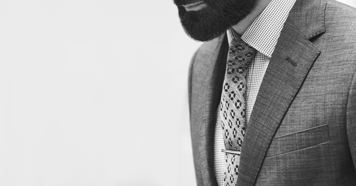
The brand swept the market with monochromatic, black and white, photography of their newly launched icons, and the public embraced the change.
The photos and ads for the campaign captivated audiences with its classic sensibilities, classic well-made tailored suits, classically styled photography and atmosphere. It called upon images of James Bond-like charm, as well as his debonair style.
It was exactly what the brand needed, a way to reach its already loyal customers while reaching out to younger generations with their choice of ambassadors. The brand was soon able to position itself as the classically suave man’s brand of choice.
Soon the campaign grew to cover their Su Misura service, a traditional Italian practice that focuses on creating uniquely tailored suits and formal wear through in-store measuring and handcrafted ensembles.
For those looking for the service, you can book an appointment with Concrete’s Su Misura team through their website.
Polychromatic phase; raising the vibrancy
The men’s fashionwear brand continues its ever-successful Concrete Iconic Men campaign as it celebrates its one-year anniversary by expanding it with an increase of saturation. Color saturation that is.
Where once we found monochromatic-focuses work, expanding their positioning as classically suave and elegant, now Concrete expands its horizons with fully colored artwork.
Although the brand’s choice to change their popular black and white style, and add vibrancy through color, could be simply attributed to the fact it is spring, it could also be a smart tactic.
Moving from its classically suave positioning, these new colorful ads are moving towards the more contemporary sophistication and modern lifestyles of the brand’s growing audience.
These new visuals are adding more vibrancy to Concrete’s campaigns and branding, and people are excited.
It is easy to see why the brand has advanced so much in the past year; through its distinctive and distinguishing artwork and visuals, the brand has been able to command attention at every turn.
And as soon as the attention wanes? They come back with force by evolving their already aesthetic visual to bring back peak interest. Whether it is through their fashionable collections or their marketing campaigns, Concrete has figured out how to keep their audience interested.


