Many businesses have decided to take this step and update their brand identity through a small change, a font change.
Companies have been changing their fonts to improve their brand, either by emphasizing its strength and age such as Volkswagen or by focusing on refreshing their look to reach younger audiences such as Pepsi.
Just as people have certain tendencies to feel a certain way when seeing a specific color, people also feel different emotions when it comes to fonts. Its these emotions that you may want to look out for when choosing the fonts you will use on your website, print items and if applicable, your logo.
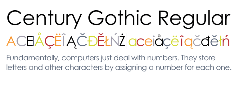 Century Gothic is seen as a chic font, and can be very fashionable and modern. Calibri is often seen as a clean and easy to font, making it perfect for websites and online pdfs. Baskerville old face can make your business seem reliable due to its old style and continuous use. There are various ways that a font can be used to make sure your brand is seen in a certain light, which is why many designers can get stuck simply on trying to find the right font.
- Advertisement -
A simple change from a thick blocky font to a sleeker more modern font can jump a logo from boring to interesting and progressive in no time.
Font Family: Serif vs. Sans-Serif
A quick typography lesson for those not familiar with Serif and San Serif fonts, which are the two biggest categories of fonts. Serif fonts are fonts such as Time New Roman and Century fonts, with text that are not consistently the same thickness and have small embellishments; these are considered classical fonts and are usually used to boldly state class, timelessness, and old school style and thinking. Famous logos that use a Serif font are Yahoo!, HSBC bank, and Daily News Egypt.
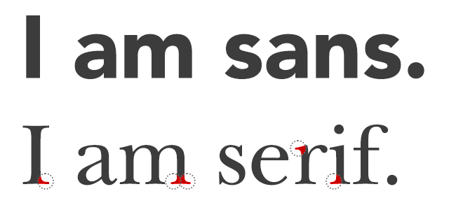
Sans Serif, French for no serif, simply mean that that do not have small embellishments at the end of texts, they also have more evenly distributed thickness throughout the text. Sans Serif is considered the font type of the new generation; it has been considered to emphasize youth, a minimalist nature, and being current and fashionable. Famous logos that use Sans Serif fonts are Vodafone, Pepsi and Facebook.
Other font families include Script, Modern and Display. These can be sorted into Serif and Sans Serif categories if need be, but are mostly in their own categories.
Famous Brands and fonts
Companies across the world have been creating branded corporate fonts for centuries, as early as 1938. The AT&T corporation, founded by the inventor of the Telephone Alexander Graham Bell and currently the USA’s largest communications company, created one of the most famous typefaces of all time, Bell Gothic.
AT&T commissioned the type due to problems with publishing their telephone directories, at the time ink would be absorbed by poor quality newspapers and would become difficult to read. In order to combat this, the company hired Chauncey H. Griffith of the Mergenthaler Linotype Company to create a font that was usable for both bold and light designs that would be readable on newspapers of that time.
In time this would become Bell Gothic, one of the most iconic fonts of the 20th century. After going through some changes to update and modernize the font, it is still used by some companies although AT&T has moved on from the font and currently uses Bell Centennial.
High end phone manufacturer Apple followed in AT&T’s footsteps, two years ago the global trend making company released a new font named San Francisco. The font was created to unify all of Apple’s products together under one cohesive font, which would be used on their operating system IOS and products such as the Apple watch and IPhones.
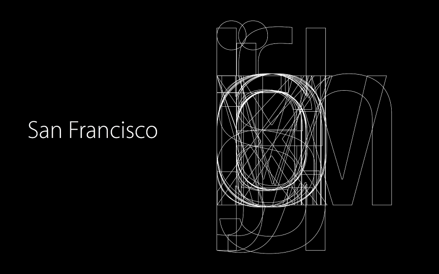
The move from the brand’s long usage of Helvetica, still used as one of the world’s most used corporate font, was not only a branding decision but to also ensure that all texts would be able to be read in both large and small screens clearly and easily. San Francisco is an example as to why fonts used in today’s world, with so many different devices to read from, need to be able to be flexible enough to move from large to smaller screens and vice versa.
Apple’s change of fonts was accepted easily due to its apparent ability to be easily read, the font itself was created with two types to ensure maximum reading capabilities in al devices. The SF font is used on devices that use the IOS such as computers and phones, while Apple Watches use SF Compact as their font.
Other famous corporate branded fonts are Intel’s “Clear,” Nokia’s “Pure,” and CNN’s “CNN Sans.” It’s not only corporations that get in on the fun, countries and cities all over the world have opted to use specially made fonts.
Unnoticed font changes in Logos
Quite a few logos have changed lately, mostly to make the change from Serif to Sans Serif fonts. There is a sense of need to change from Serif fonts to Sans Serif now in order to keep with the times and reach to newer generations of potential customers. The feeling of Serif’s strong imposing nature may be why many brands have decided to make the change and update their logos.
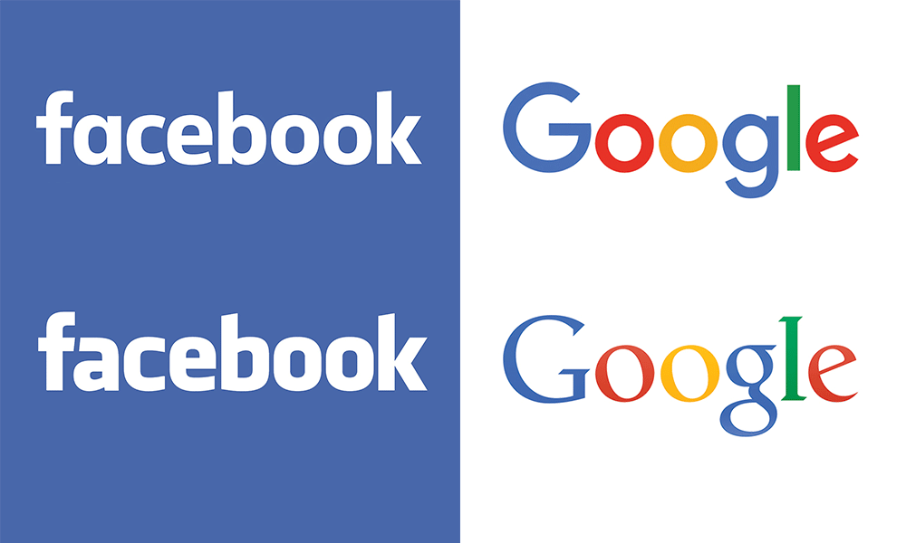
Google new and old logo
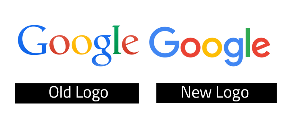
Last year, Google changed their logo to introduce a more fun and engaging feel to the company and famous search engine. Many did not see the change for a while, but did feel the effects that the new text created.
 Facebook new and old logo
Another change that came out last year, the Social media powerhouse updated their logo with a specially made font just for them.
![]() The larger open spaces in the letters A and Os create a more open feeling of space and openness, and its new E provides a feeling of a smile. The font change also comes with a lighter blue hue to continue its move towards a more open impression.
The larger open spaces in the letters A and Os create a more open feeling of space and openness, and its new E provides a feeling of a smile. The font change also comes with a lighter blue hue to continue its move towards a more open impression.
Egyptian Streets new and old logo
The young Egyptian independent news media organization has been around only for a short while, but has not only gained a steady following of young Egyptian Adults and foreigners living in the country, it has also gone through some drastic changes to its logo’s font.
![]()
The biggest changes that can be noticed with these fonts are the Gs and the spacing between letters, making it easier to read as well as gives a sense expertise and competence.
Souq.com new and old logo
The Middle East online marketplace giant changes its specialized font last year to a now more modern and appealing font and look. The font still contains a S that is similar to its old logo but is upgraded with sharper inner curvatures.
![]() The change made to the logo makes it more appealing to younger users of the online marketplace, and more modernized. Many people have stated that they saw the new logo but didn’t notice its complete change from its predecessor.
The change made to the logo makes it more appealing to younger users of the online marketplace, and more modernized. Many people have stated that they saw the new logo but didn’t notice its complete change from its predecessor.
Concrete
The Egyptian fashion brand and clothing manufacturer has recently turned heads with its newest campaigns, so much so that many have neglected to see that Concrete’s logo has been updated to be consistent with the campaign.
![]() Out goes the Serifs as Concrete uses a more modern Sans Serif font along with better spacing to provide a more progressive and lighter logo, one that follows the company’s first steps into what seems to be a better and progressive future.
Out goes the Serifs as Concrete uses a more modern Sans Serif font along with better spacing to provide a more progressive and lighter logo, one that follows the company’s first steps into what seems to be a better and progressive future.
Suez Canal new and old logo
Although it was announced on various news stations, the average Egyptian only knew that there was a new logo for the expanding Suez Canal but could not remember the difference between it and its old logo.
![]() The font outline and shadows are thrown out for a gradient filled Sans Serif font that brings memorability and appeal.
The font outline and shadows are thrown out for a gradient filled Sans Serif font that brings memorability and appeal.
Why make a font when you can find one online?
The reason why many companies decided to create custom fonts is due to copyrights and licensing rights. For companies that use pre-created fonts, they have to constantly pay royalties and licensing rights every time the font is used or applied.
In the long term, this may cost up to billions of dollars, making it a difficult way to maintain profits when you pay every time you write a profit report.
Another reason would be that creating your own font gives your brand a stronger and more cohesive identity. The font, just like with a logo or website, is an extension or expansion of the brand. The customized font itself can be immediately associated with a brand and/or company, such as with logos.
Fonts aren’t only for corporate
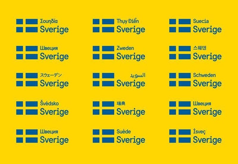
Countries who famously made headlines for creating their own country-wide used fonts are Sweden’s Sweden Sans and Canada’s “Canada 150.” Both fonts were created with the main languages of the county in mind, with Canada’s font including French and Aboriginal lettering.
Cities in the USA such as Chattanooga, Chicago and Kanas all have their distinct fonts. Rome, London and Berlin also have their own fonts which were all commissioned by the city to brand itself. London’s type “Johnston Sans” has been used for the city’s public transportation hubs since 1933, and has since been called the “Helvetica of England.”