How did the logo’s journey start?
Did you know that almost all of the brands we know today had a different logo when they were first launched? You would be surprised by how much the logos were different back then and you can see the evolution journey that every logo went through.
Each logo of each brand has a story behind it and today we will tell you the evolution story of the biggest and most famous e-commerce brand, Amazon.
Also Read ➤ Jeff Bezos’s farewell letter as CEO of Amazon: “It’s still Day 1”
- Advertisement -
Amazon was launched by Jeff Bezos in 1994 as Cadabra and in the same year, it turned into Amazon. Bezos didn’t want the branding’s budget to be high so he decided to go for a minimal logo. Even though the logo was so minimal, it didn’t fail to have a modern look and be recognized which made it known globally.
The Beginning: From 1995 – 1997
The first Amazon logo was developed in 1995 by Turner Duckworth and it had a great graphical concept behind it.

The logo took the shape of the letter A and as it is the main element and a vertical white line was in the middle, which presented the Amazon river. The wordmark “Amazon.com” took place under the logo.
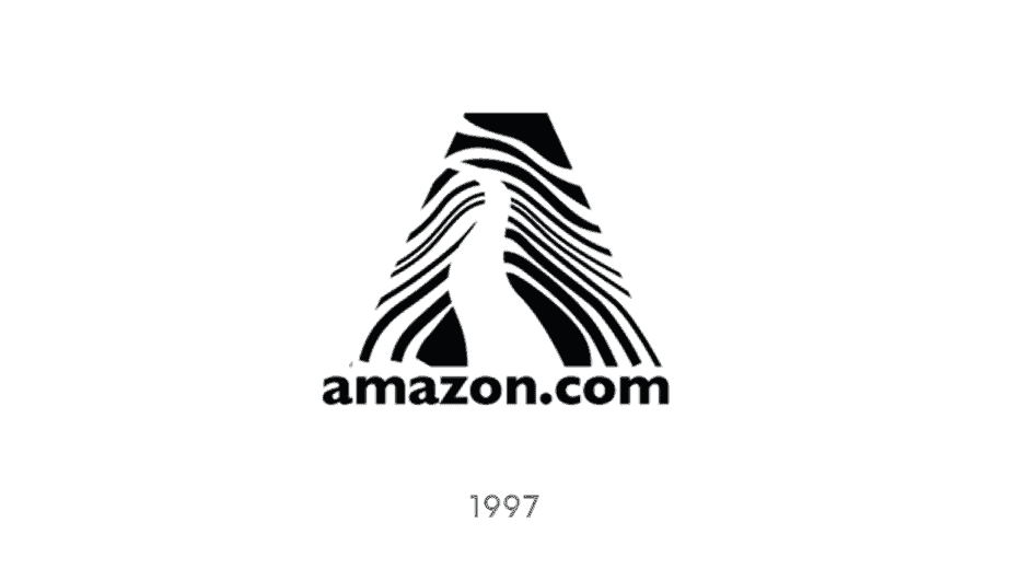
1997- 1998 Logo [The Zebra Pattern]
In 1997, the logo had a few changes as some horizontal lines were added to the letter A shape to make it look like a tree and it also took the zebra pattern.

The color palette of this logo was still monochrome. As for the wordmark, the style was slightly changed and the lettering became bolder, while the emblem was redrawn and made smaller and more elegant.
Even though the logo had few changes, it kept the wordmark “Amazon.com” in the same place.
A Major Transformation: 1998
In 1998, Amazon made a huge change to the logo and removed the A letter shape. The brand created a simple logo consisting of the wordmark “Amazon.com” in a very simple way with a simple font with “Earth’s Biggest Bookstore” written underneath.
 Even though the logo completely changed, it didn’t last long as the brand decided to make some other changes in the same year.
The next version was designed using the new color palette – black and intense yellow. The letters of the logotype were now capitalized and the letter “O” in yellow was enlarged.

From the launch of the logo up until 1998, the logo was monochrome until the new version created in 1988 that came to life including the color yellow for the first time.
The logo was written in capital letters and the letter “O” was written in a yellow large circle. Also, the tagline was removed.
From 1998 to 2000
Another change to the logo was made in 1998 but it lasted till 2000.

Later in 1998, the logo went through another change, as the brand changed the font of the wordmark amazon.com to make it bolder and with lowercase letters, and the word “.com” was less bold. The brand also added an arched yellow underline.
From 2000 to The Present Day [from A to Z]
In 2000, the logo went through another change and became the one we know now.
The new 2000 logo was similar to the one in 1998 but it looked more modern. The logo had “amazon.com” in lowercase letters and the arched yellow arrow matched from the letter A to Z.

The arched arrow has double purposes, the first purpose, it looks like a smile, and the second one, the way it matches the two letters A and Z delivers a message that Amazon got you covered from A to Z.
The current Amazon logo is composed of a wordmark “Amazon” in the lowercase letters. Later on, “.com” was removed from the logo to officially become just “Amazon”.

Amazon Icon
Definitely, one of the most recognizable graphical icons in the world, the Amazon icon, is built around two simple symbols — a lowercase letter “A” in bold black lines and an arched arrow, resembling a smile under it.
![]() The iconic smile-arrow symbol, created by Turner Duckworth, is playful and friendly, evoking a sense of reliability and happiness. The black and orange color palette only adds to these feelings, making the visual identity bright and perfectly balanced.
The iconic smile-arrow symbol, created by Turner Duckworth, is playful and friendly, evoking a sense of reliability and happiness. The black and orange color palette only adds to these feelings, making the visual identity bright and perfectly balanced.
Also for the font used in Amazon Logo, the lowercase Amazon logotype is executed in a bold and traditional Sans-serif typeface with smooth thick lines, slightly curved tails of both “A”s, and straight cuts. The font, used for the logo is Officina Sans Bold, which is pretty close to such fonts as Dynamic Grotesk Bold and Capital Gothic Bold.
Out of all these logos, Which one is your favorite?


